8 Contact Page Mistakes Costing You Leads (& How to Fix Them!)


Up to 80% of website visitors reach your contact page but leave without hitting “submit”. That’s 4 out of 5 of your “could-have-been” leads slipping away. Just because … of your contact page. In this article, we break down 8 contact page mistakes you might be making and show you exactly how to turn those missed chances into opportunities.
Spending countless dollars on ads but still not getting leads? Endlessly tweaking your campaigns, creatives, and content, and yet, conversions remain flat?
Chances are, you’re looking in the wrong place. The issue might not be your marketing, but your contact page.
After all, every paid media dollar and marketing effort you spend acquiring traffic will only be burned if your contact page fails to convert visitors into leads.
When done right, your contact page can capture 2–3x more leads than the industry average, helping you outperform competitors and turn more traffic into opportunities. More captured leads mean higher sales, better ROI, improved ROAS, and ultimately, a healthier bottom line for your business.
That’s why our team took a closer look at what makes a contact page truly work. After auditing countless websites, we’ve uncovered 8 common contact page mistakes that are quietly costing most businesses (maybe even yours).
1. Asking for too much info
One of the biggest contact page killers is asking for too much information too soon.
A study shows that asking for a lot of information kills conversion by up to 27%. Turns out the more you ask, the more conversion drops.
So, how many fields are too many?
The ideal number of form fields for most contact pages sits around 3 to 5, with 3 (or even fewer) improving the conversion rate by up to 25%.
Leads are more likely to complete your form if you only ask the basic questions, such as:
- Name (first name or nickname only is even better)
- Email address
- Message or reason for contact
Anything beyond these core fields needs to be carefully justified.
Depending on the industry, asking for phone numbers is particularly problematic because of security concerns and unwanted calls at inconvenient times.
Take a look at this contact form by Osome. It’s a great example of simplicity done right.
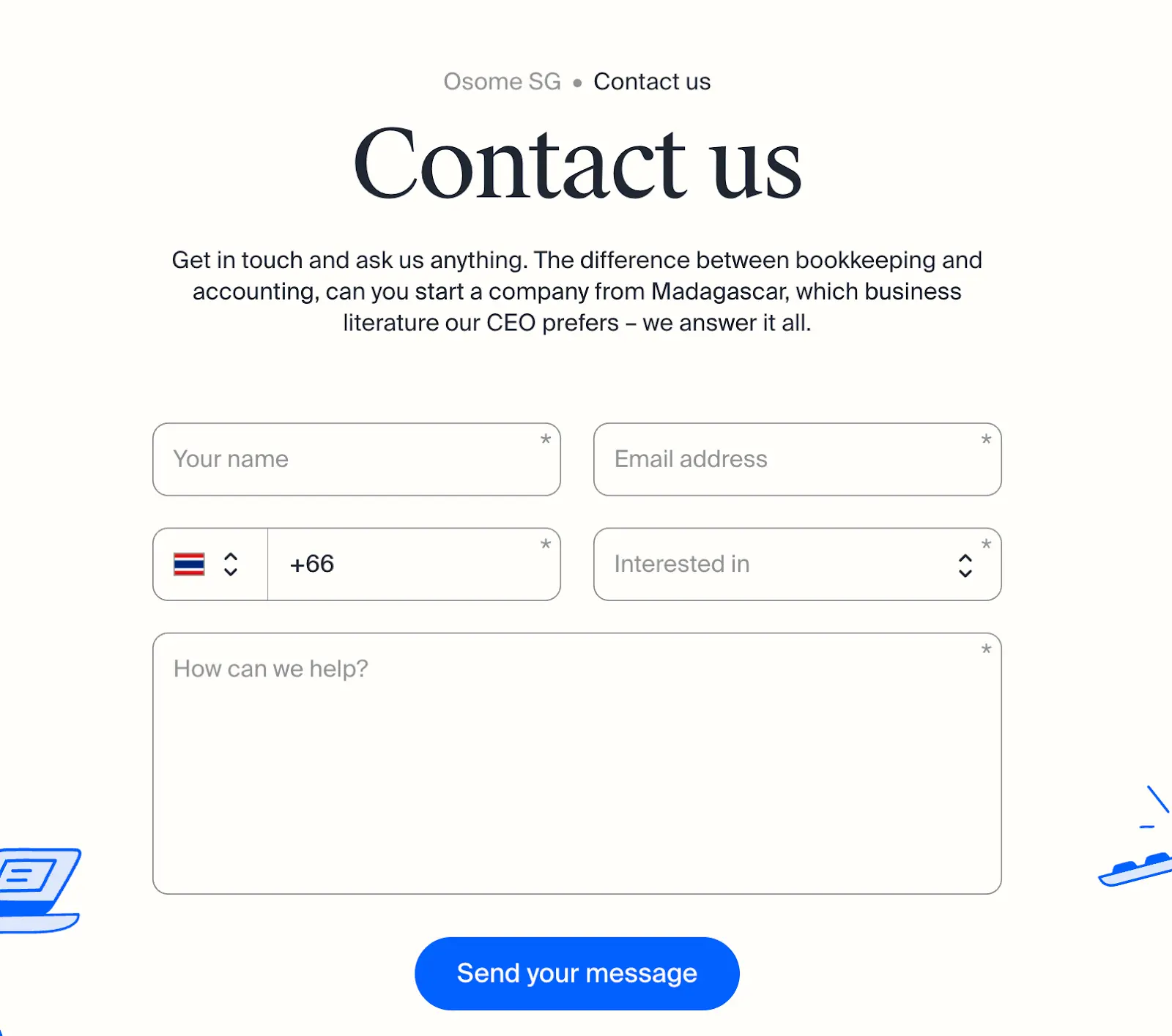
It uses quick dropdowns, clear options, and plenty of space for longer messages (with a friendly “How can we help?” prompt). Fast, approachable, and easy to complete. Most users can finish it in under five minutes without feeling overwhelmed.
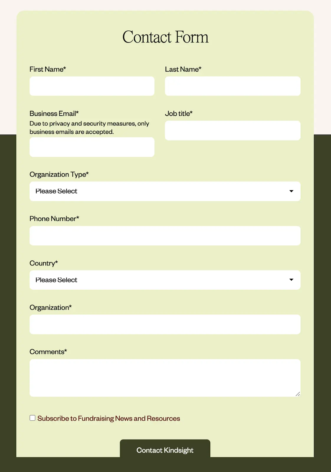
Compare that to a longer form like Kindsight’s below. Even with dropdowns, answering 5+ questions can feel like a chore, increasing friction and decision fatigue. Users today expect fast, effortless interactions; anything more can tank completion rates.
But what if your business really needs additional information?
Consider using a two-step approach: Collect essential details on the first submission, then gather more specific information after establishing contact.
2. Using vague or generic headlines
Your contact page headline is prime real estate. Yet 9 out of 10 websites we audit waste it with the same boring “Contact Us” or “Get in Touch” text buttons.
These generic headings don’t tell visitors what they’ll get, only what you want them to do.
You can actually do better.
A strong headline grabs attention and gets visitors to take action. And to hook them into that action, make the outcome clear.
What will they get if they do ‘this or that’? How much can ‘this solution’ save them? How much can this make them grow?
It should be about them, and not you.
When you tell people exactly what to expect and what’s in it for them, they’re far more likely to hit that button instead of second-guessing or bouncing off the page.
Here’s what that looks like in practice:
See the difference?
Specific and action-oriented headlines sell the next step by promising value. They instantly answer the critical question every visitor has in mind:
"What's in it for me?"
Just make sure to tailor your headline to your offer and industry. What works for a SaaS demo might not fit a financial service or agency inquiry. The goal here is to make that headline button feel relevant, personal, and worth the click.
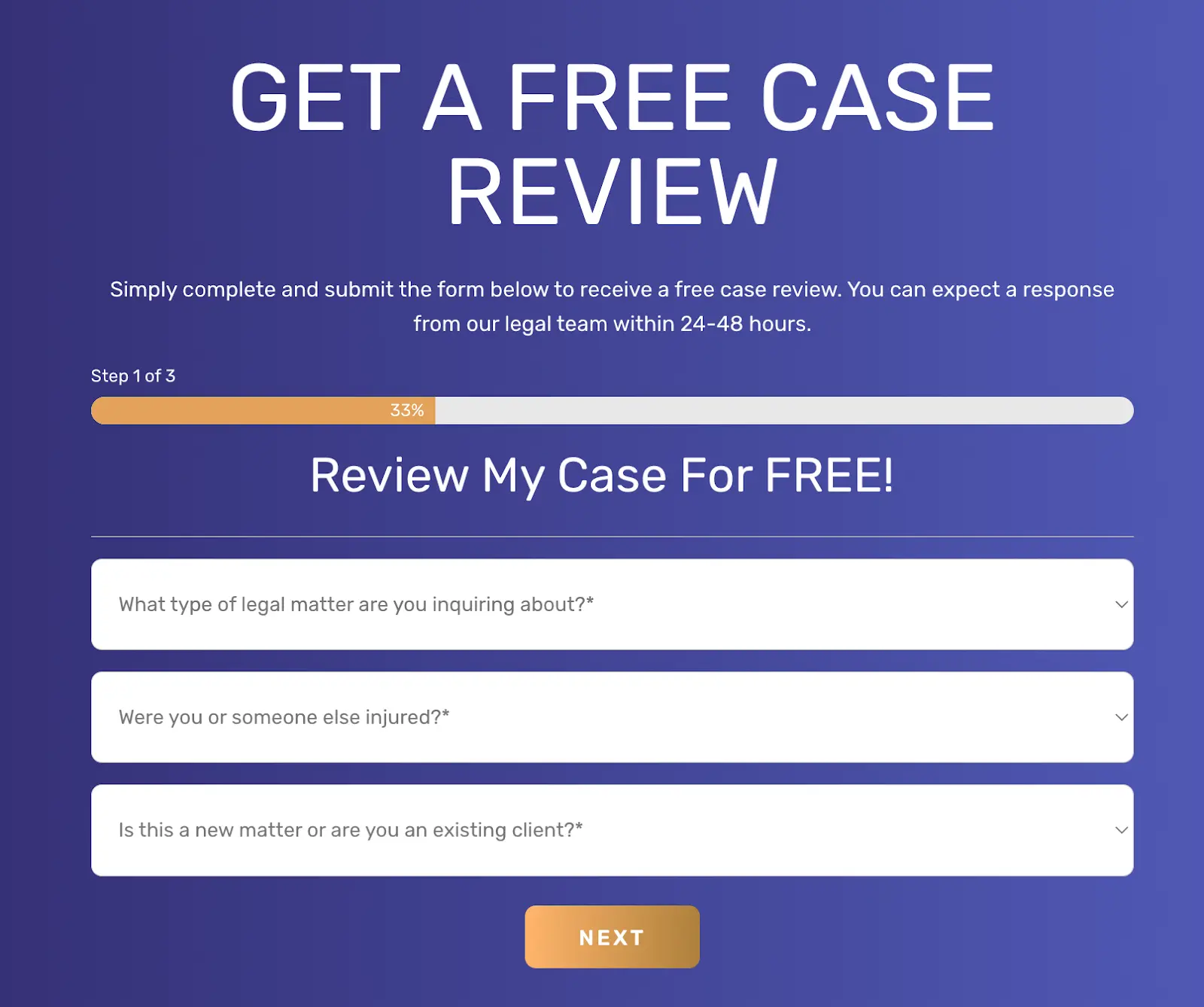
The Perecman Law Firm shows how a strong headline works. Instead of simply saying “Contact Us,” they offer visitors a “FREE CASE REVIEW.” Not to mention that “GET” verb there, it drives people to action.
Clear action + clear value = warm leads.
This is how a clear, outcome-focused headline removes hesitation and nudges users to act.
But just a quick side note: When crafting your headline, make sure it also matches the intent of the specific page or ad that brought visitors to your contact form.
If your ad promises a “free consultation,” your contact page should echo that same message, not just say “Contact Us.”
That alignment builds trust and helps users feel confident they’ve landed in the right place.
3. No clear value proposition or next-step promise
Even with a great headline, visitors will still hesitate if they don’t know what happens after they hit “Submit.”
Uncertainty creates friction, and friction kills conversions.
Your contact page should make the next step crystal clear. Spell out:
- What happens right after form submission (e.g., “You’ll get a confirmation email right away.”)
- How soon they’ll hear from you (e.g., “Expect a reply within 24 hours.”)
- Who will contact them and how (e.g., “Our customer success team will reach out via email.”)
- What value will they get from the interaction (e.g., “Get a free 30-minute consultation.”)
For example, if you are a service business, make it clear by stating:
"After you submit this form, you’ll receive a confirmation email with a link to schedule your free 30-minute consultation.”
Consider how Proximity Plumbing nails this ‘next-step promise’ technique.

Their contact page clearly shows what users get and what to do next: 30-minute onsite service, with flexible contact options— either call by phone or use the easy 24/7 online booking.
Small tweaks like this go a long way in removing doubt and setting clear expectations with your leads.
4. Missing trust elements that give you credibility
When visitors land on your contact page, they're actually making split-second trust evaluations.
“Can I trust this business with my info?”
Without the right trust signals, they will leave.
So what can build trust? Simple cues that show you’re real and reliable:
- Your physical business address (even for digital businesses)
- Direct phone number (preferably not just a generic helpline)
- Reviews or testimonials specifically about your response time or service
- Security badges or privacy statements near form fields
- Photos of team members who will receive the inquiry
These elements work together to build legitimacy and establish security. They’re proof points that tell visitors, “We’re a real team, not a faceless form.”
Take Folk’s example below.

Their contact page keeps it simple with a 3-step form, complemented by solid proof points: trusted by 2,000+ agencies and firms, and near 5-star reviews on noted platforms like Product Hunt, Chrome, and G2. It instantly signals credibility and even sparks a touch of FOMO. Who wouldn’t trust them when everyone already does?
On a side note: The ‘trust emphasis factor’ might look a bit different depending on your industry. For instance, if you sell financial services, you might need to show off security badges and privacy statements. Or if you run a tourism business, response-time guarantees and review snippets may give you better results.
But the principle behind it is the same: Make it easy for people to believe you’re legit by adding trust elements in your contact form.
5. Slow or non-mobile-friendly form load
Studies show that conversion rates drop by 7% for every additional second of load time, and 53% of mobile users abandon pages that take longer than 3 seconds to load.
You might have an optimised contact form, but good design will be useless if it doesn’t load in time.
If your contact page takes more than two seconds to load, you’re going to lose leads.
So ideally, aim for a 3-second max load time on both desktop and mobile. Anything slower, and you’ll see your conversions slip, especially from mobile users who have thinner patience.
To check your contact pages' load speed, use the following diagnostic tools:
- GTmetrix: See your total load time and spot bottlenecks.
- Google PageSpeed Insights: Get mobile-specific scores and suggestions.
- WebPageTest: Test across devices and connection speeds.
Mobile users are often on spotty connections, so every kilobyte matters. Compress your images, minimize JavaScript, and enable lazy loading for any elements below the fold.
6. Lacking optimized design layout and visual hierarchy
Eye-tracking studies show that users don't read contact pages, but scan them in an F-shaped pattern. Meaning, users notice only the top and left sections first.
So if your layout doesn’t guide their eyes, people won’t know where to look, and they’ll likely leave instead of figuring it out.
A properly structured contact page uses enough spacing, the right font size, and color contrast. These elements, when rightly blended, create natural reading patterns that highlight (and do not compete) the most important elements.
Ideally, visual hierarchy follows this simple pattern:
- Headline: biggest, boldest text — instantly tells them what they’ll get.
- Supporting text: smaller but still visible; clarifies next steps.
- Form fields: grouped logically with enough breathing room.
- CTA button: stands out with color contrast and white space around it.
Take Runway’s contact form as an example.

Their headline, “Fast Track to Clarity,” is bold and communicates value in a snap. The “750+ integrations” + app icons highlight features and benefits at a glance. Add a strong customer review (50x–100x figure), complete with the customer’s photo, and visitors immediately see credibility.
And the best part? It’s all on one page, but with zero eye-clutter.
This is visual hierarchy in action: balanced spacing, clean colors, and a natural path for the eye to follow. It does more than just “look clean.” They help your visitors think less and act faster (which also means higher conversion rates for you).
7. Poor error handling and validation messages
Another common and frustrating contact form mistake that users really hate: “pogosticking”.
This is when people have no idea whether their input will be accepted until they hit “Submit.” The form rejects them, they fix one field, hit submit again, and repeat the cycle. Over and over.
It’s guessing, failing, and trying again with zero feedback in between. And most users don’t stick around long enough to win that avoidable game.
What can help?
Real-time error validation. This is when feedback appears while users are filling in the form. This is more user-friendly and proven to improve form completion rates by up to 22% compared to displaying error messages after submission.
And in crafting your validation messages, make sure it’s CLEAR. Vague “invalid input” messages don’t help. You’ll lose them to the guessing game.
Consider these examples of confusing vs. user-friendly error messages in contact forms:
See the gap? One message leaves people guessing what went wrong. The other tells them exactly what to fix, right away.
Once again, the principle stays the same: Clarity converts.
Make it clear what went wrong and how to fix it. Spell out the next step so users don’t have to guess. Avoid vague, robotic messages at all costs. Because when people understand what to do next, they don’t bounce.
8. CAPTCHA friction and spam issues
And lastly, trying to stop spam with CAPTCHA. While CAPTCHA helps block bots, it often blocks real leads too.
Studies show CAPTCHA friction can reduce form conversions by up to 40% because users find them annoying, confusing, or inaccessible, especially on mobile.

Those small puzzles (“pick all images with crosswalks”) add unnecessary friction and slow users down. For people with disabilities, they’re even harder to complete.
But skipping spam protection isn’t an option either. Without it, your inbox fills up with fake or bot-generated messages, wasting time and cluttering your CRM.
So, what’s the fix? Strike a balance between security and usability.
Here are some user-friendly alternatives:
- Honeypot fields (hidden inputs bots fill in)
- Time-based validation (blocks suspiciously fast submissions)
- Behavioral detection (analyzes visitor patterns)
- Google reCAPTCHA v3 (invisible and runs in the background)
Instead of CAPTCHA, we recommend using smarter and more discreet tools like honeypots or Google's reCAPTCHA. These tools run in the background, spotting bots by tracking visitor behavior, without making users solve puzzles or click checkboxes. That way, you keep the bots out and make it effortless for real users to hit “Submit.”
Don’t let a weak contact page cost you more leads
If your contact page shows any of the eight mistakes we’ve covered, chances are you’re losing qualified leads.
The good news? You don’t need a full website overhaul to fix it. Small, focused tweaks can make a big difference.
Here’s a simple 3-step framework to get started:
- Audit your contact page. Identify usability gaps, form errors, and points where visitors drop off.
- Apply quick wins. Simplify the form, sharpen your copy, and remove unnecessary distractions.
- Measure and refine. Track results, test one change at a time, and continue optimizing.
Or leave it to the experts — that’s where we come in. At SuperPresence, we’ve helped businesses transform underperforming contact pages into reliable lead generators through strategic design and CRO best practices.
Whether you need a contact page redesign, conversion rate optimization, or a full website overhaul that helps you turn visitors into customers, we can help.
Book a free strategy call, and we’ll help you uncover what’s holding your conversions back (and how to fix it fast).
FAQ
How many fields are too many on a contact form?
The sweet spot for contact forms is 3-5 fields. The longer your contact form is, the more frustrated your leads will become, and the higher the chances they will abandon your page. Keep it simple.
What is a good contact-form conversion rate in B2B?
For B2B websites, contact form conversion rates typically range from 2 to 5%. Your ideal benchmark depends on your industry, traffic quality, and sales cycle length.
How do I stop spam without hurting conversions?
Google's reCAPTCHA v3 offers the best balance of security and user experience because it works completely invisibly, analyzing user behavior without requiring any interaction from real visitors.
Should I show my email address or only a form?
Display both a contact form and an email address to accommodate different user preferences and build trust through transparency. Forms provide structure and CRM integration, while visible email addresses signal accessibility for users who prefer direct contact.
From Sydney, Australia with a decade in Asia, Kevin built his expertise driving product and growth at tech startups across fintech, logistics, consumer apps, and crypto. He founded SuperPresence with this expertise and passion, helping businesses create high-converting web experiences and digital growth strategies that drive real revenue impact.
Continue reading more expert-insights