6 Proven Strategies to Generate More Leads from Your Website

Drive more conversions from your existing traffic with these six foolproof strategies for designing an optimised B2B landing page. Learn how to warm up leads by cutting friction, building trust, and being clear.
You can run the best Facebook ads, spend thousands on Google paid search, and craft scroll-stopping creatives that get clicks. But if your landing page or website fails to convert those visitors into leads, you're only burning your marketing spend.
According to WebFX, the average conversion rate for a B2B business is 2.23%. This is low. Not to mention, top-performing pages achieve up to 10%. That’s a huge gap of nearly 8% difference.
If you're a business owner and your website's conversion rate is around the average, then this article is for you. If you optimise your landing page properly, you'll be able to outperform your competitors, even those with larger marketing budgets.
What exactly makes up a high-converting B2B landing page? How can you turn risk-averse and deliberate B2B buyers’ interest into action?
Here’s how we strategically design sales-accelerating B2B landing pages for our clients in SuperPresence:
1. Clarify the value proposition immediately
When your lead lands on your page, you have a tiny window (about 2 to 3 seconds) to grab their attention before they decide whether to scroll or bounce.
How can you grab attention?
Make your value proposition clear and simple. Your landing page should be able to immediately answer a potential prospect's questions like:
- Who do you serve?
- What specific problems can you help me solve?
- Why does it matter for my business right now?
Clarity is key here.
Trying to sound smart more often than not ends up being vague, and this creates more friction and time for them to understand what you do and how you do it.
Vague generic claims like “We provide innovative solutions to businesses that want to grow” give almost no context.
Instead, clearly define ‘what innovative solutions you provide’. Answer what specific businesses you help, and how you can help them grow.
Take this optimised value proposition, for example:
“We help SaaS startups improve customer retention by 25% through automated onboarding workflows.”
The message is clearer.
- You help who: SaaS startups.
- Problem: Improve customer retention
- What solution do you provide: Automated onboarding workflows that increase 25% customer retention
Take a look at SiteMinder's landing page below. They're a hotel management software company.
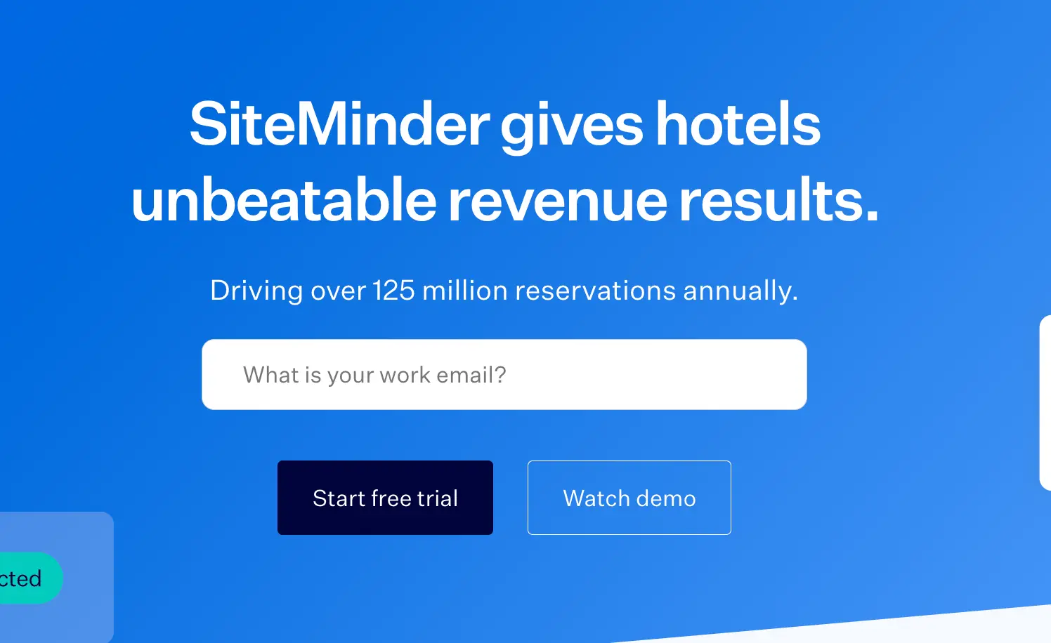
At first glance, this sounds impressive: “SiteMinder gives hotels unbeatable revenue results,” but it's vague; it creates more questions than it answers.
What results? And what makes those results ‘unbeatable’?
The line “Driving over 125 million reservations annually” is impressive, but what’s in it for the hotel business reading it? Numbers like that show scale, not value.
To make the message resonate, a little context on how SiteMinder helps hotels achieve those results can go a long way.
Here’s one way to strengthen the copy:
More bookings. Higher margins. Less effort.
Join 40,000+ hotels using SiteMinder’s all-in-one platform to manage distribution across 450+ booking channels, drive more direct bookings, and increase revenue — powering over 125 million reservations every year.
Now the value for the hotel owner is clear: it’s not just about the volume of bookings SiteMinder drives, but how their platform makes hotel growth simpler and more profitable.
Now compare that to Workflex’s value proposition below:
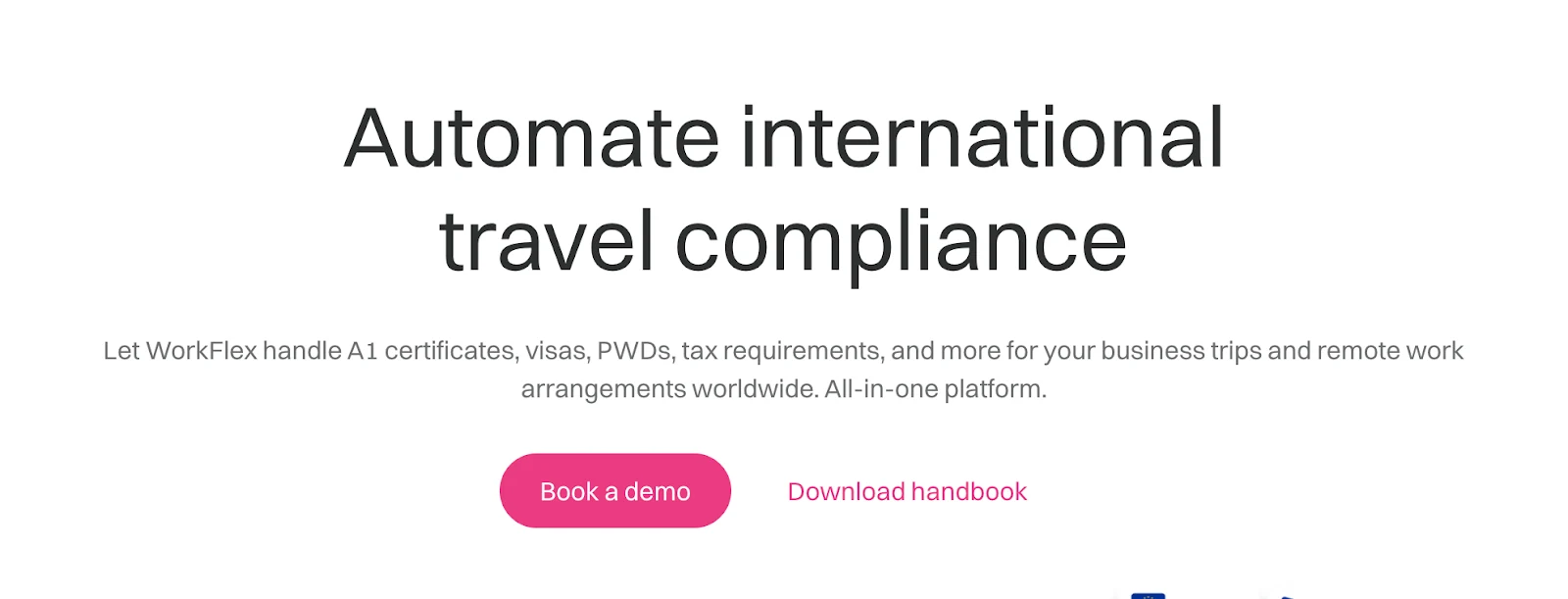
WorkFlex leads the heading with exactly what it does: “automating international travel compliance”.
The copy then backs this up with specifics. The subtext lists real pain points it solves: “A1 certificates, visas, PWDs, tax requirements, and more”. And we also know exactly what it's for, "business trips" and "remote work arrangements".
2. Deliberately use social proof
B2B buyers are naturally risk-averse. They need proof that your solution works before they’ll even consider a conversation. That’s understandable because you’re not selling shoes here. You’re offering solutions that impact entire teams — and can either make or break a business.
The right social proof elements can reduce this hesitation. Your landing page should clearly and immediately answer: “Who have you helped, and what impact did you deliver?”
When B2B visitors see that companies like theirs have already succeeded with your solution, the decision becomes less risky.
There are a number of different ways that you can add social proof to your landing pages.
Use a logo cloud that shows the brands you’ve worked with
Incorporating a “logo bar” is an effective yet simple solution to build social proof.
Take a look at this example below:
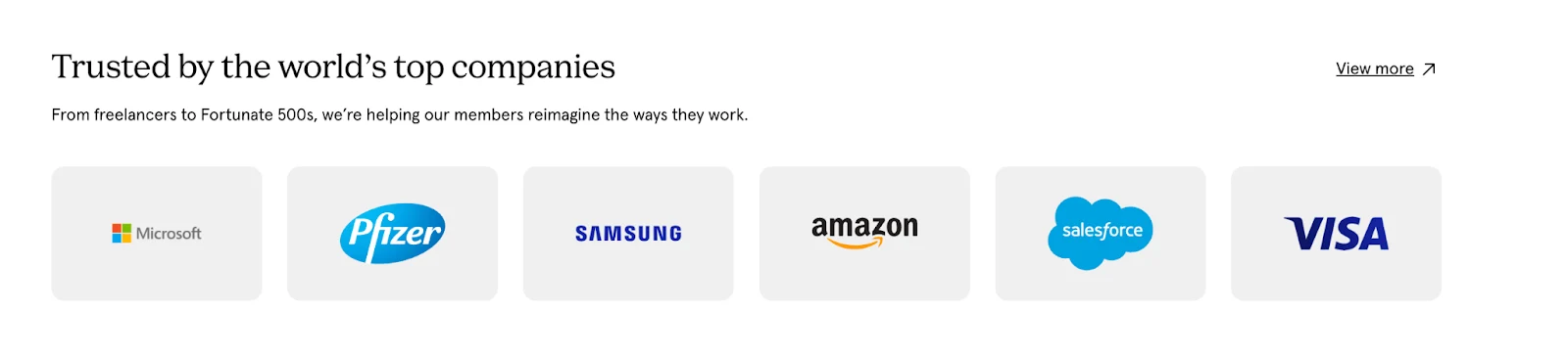
Order your logos by recognisability. Place the most prominent brands first.
In the example above, it shows “Microsoft, Pfizer, Samsung, Amazon, Salesforce, and Visa”. All are big names, and when leads see them, trust surely follows.
If these giant firms trust them? Then why shouldn’t I?
Showcase your customer reviews & testimonials everywhere
If you already have several testimonials from past clients, showcase them. People trust people.
When they hear how your previous clients talk about you, they’ll be more likely to trust you.
Take this example below of Wayflyer’s landing page displaying 5-star customer reviews from Trustpilot.
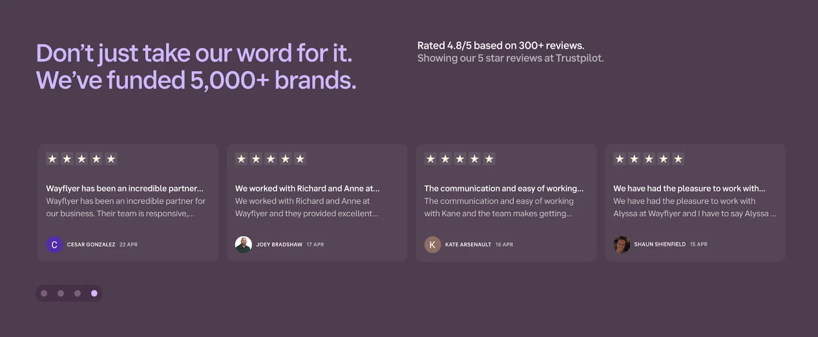
The heading specifically says, “they’ve funded 5,000+ brands”. Customer reviews back this up, showing the impact they’ve made on those brands.
- “An incredible partner in our business. Their team is responsive.”
- “We worked with … and they provided excellent service…”
- “The communication and ease of working with … ”
This kind of social proof is gold. With it, your previous clients are helping you sell on your behalf, and speaking in the same "language" as your prospects.
Add industry certifications and awards when relevant
If you’re in an industry with strict compliance or security standards, prospects often look for certifications and qualifications that signal trust.
Include badges like SOC 2, ISO 27001, or other credentials that address your audience’s specific concerns, especially around data handling or privacy.
Take another section from Wayflyer’s landing page below:
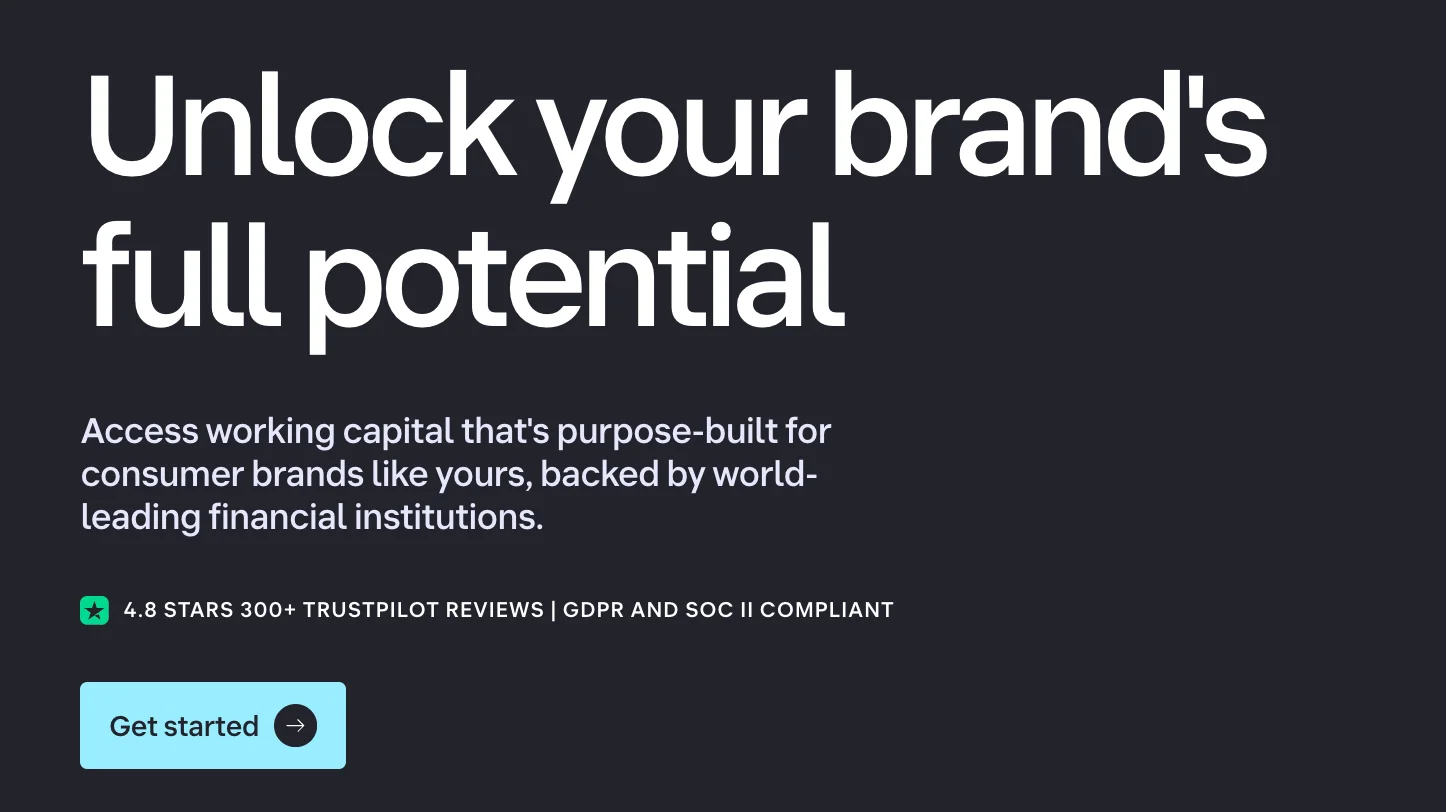
Just above the CTA [Get Started], Wayflyer boosted that trust factor with “GDPR and SOC II compliance”.
This is crucial, as Wayflyer, a fintech company, handles large amounts of sensitive business data for its customers.
This certification badge tells its visitors: “We take your data security seriously. Our GDPR and SOC 2 badges mean your financial and performance data are handled with the highest standards of protection.”
You can give your prospects that same confidence.
Add customer case studies that show real results
B2B buyers need more than claims. They want to see proof. Case studies are one of the most persuasive ways to show how your solution drives real business outcomes.
You can present case studies in two ways: short-form highlights or detailed deep-dives.
Micro case studies are essentially stats with context. They work perfectly near CTAs, in testimonial sections, or beside product features. In writing this, focus on the result, not the story.
See how Mews did a good micro case study with their landing page below:
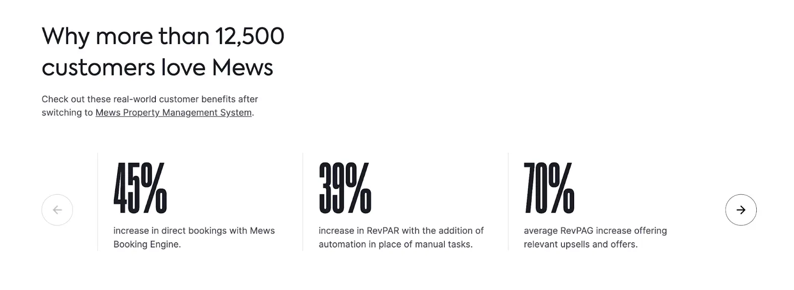
As you can see, Mews showcases stat-based wins from real customers in a visual carousel. Each slide highlights a specific, quantifiable result like a 45% increase in direct bookings or a 70% bump in upsells, tied directly to their product. It’s scannable and delivers proof in under five seconds.
On the other hand, full case studies best suit high-ticket B2B offers or risk-averse industries.
But since you only have limited space on a landing page, you can keep it short with micro case studies. Then, link out to full versions that break down the problem, approach, and outcome in detail.
In writing full case studies, it’s imperative to use a consistent and easy-to-skim structure like:
- Client name and industry
- The challenge they faced
- How your solution helped them
- The outcome (with specific metrics)
- A direct quote from the client
[Provide screenshots]
TIP: If you don’t have case studies yet, start collecting results from early clients. Even small wins, like a 30% increase in email replies or 20 fewer hours spent onboarding, can move the needle when packaged well.
Showcase your awards and expertise
B2B buyers want confidence before they commit. Awards, certifications, and credibility stats give them that reassurance.
Badges from recognized platforms (like G2, Clutch, or industry associations) build immediate trust. Pair them with clear, quantifiable proof points instead of making vague claims.
Consider how this is done with the landing page sample below:
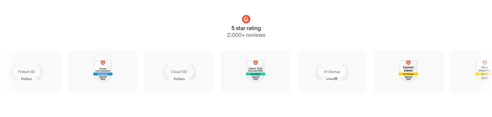
This is a great model of social proof that builds authority fast. Instead of just saying they’re trusted, this brand shows it with badges from reputable platforms and a 5-star rating across 2,000+ reviews.
Visual, specific, and credibility-rich.
Here’s another case of nailing awards and expertise in a landing page:
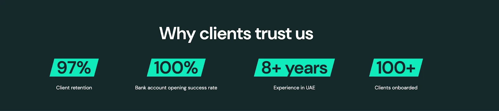
See those numbers?
It’s intentional, solid, and credibility-building. Instead of vaguely claiming they’re legitimate, they show it by their success rates, years in service, and hundreds of clients supported.
It’s like they’re saying: “You can trust us because we have achieved …”
97% client retention, 100% success in opening bank accounts, 8+ years of experience, and over 100 clients onboarded.
It’s proof at a glance, giving potential customers real reasons to believe.
3. Design and place CTA buttons that stand out and compel action
Your CTA is the culmination of everything on your landing page. It's where interest transforms into action.
But could your CTA placements limit your conversions?
That happens when CTAs are not given visual priority.
Could it be that your CTAs are with a tiny button, light font, or generic plain text styling? Or is it placed too far down the page or tucked away in a corner?
If this rings a bell, your CTA button may be buried in poor design, hierarchy, and placement. As a result, your visitors may have to search for what to do next because they don’t notice it right away.
To make your CTAs stand out:
- Use contrast and white space so your button pops against the background. Make it visually dominant with bold color, size, and clear hierarchy.
- Place CTAs strategically — one above the fold, another after trust-builders, and one at the end.
- Avoid clutter so the button draws attention naturally.
Alongside these design principles, your CTA buttons should compel action. Use action verbs that highlight value.
For example, generic "Submit" and "Click Here" don't inspire your visitors to take action. It’s like directly telling them to “do this” but not telling them “why they should” in the first place.
Once again, clarity is key.
Use language that reinforces what they’re getting (what’s in it for me?) and gives them a sense of control.
Consider how Unified Lawyers gets the CTA right in their landing page below:
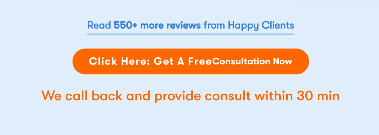
Didn’t the bright orange button grab your attention immediately?
This CTA stands out. In a sec, you know where to click.
And the microcopy is clear: “Get a free consultation now”. The value is clear.
Then, just below, the follow-up text sets a specific expectation: ‘they’ll call back and provide a consultation within 30 minutes’.
If you are the visitor, you know what to do, what you’ll get, and what to expect.
How can you do the same with your CTA microcopies?
Here are a few quick upgrades you can mirror to:
- “See How Much I Can Save” instead of “Get Started”
- “Book a Call with an Advisor” instead of “Contact Sales”
- “Schedule My Consultation” instead of “Contact Us”
- “Get My Case Review” instead of “Submit”
- “Start My Free Trial” instead of “Sign Up”
Although CTA copies largely depend on the industry you’re in. But these examples show how to create psychological ownership. Do so by making the prospect feel like ‘they can personally get something valuable’ before they've even clicked.
4. Explain how you do it
B2B buyers don’t just want results; they want to understand your approach.
A dedicated section in your landing page about your process is how you can communicate that.
One clever way is to outline your steps in a way that feels easy to follow, even for first-time clients. A simple 3 to 5-step visual or layout works best for this.
For example, a standard process outline for most B2B service providers looks like this:
- Step 1: Initial consultation or discovery call
- Step 2: Customized proposal or onboarding
- Step 3: Execution, setup, or delivery
- Step 4: Ongoing support, results tracking, or handoff
Your key focus here is to convey how your processes remove their stress and make their work simpler. When writing these, it’s ideal to use short, benefit-driven copy under each step. You want to lessen the prospect’s guesswork by keeping it direct and simple.
For example, consider how YouStock lays out its process in its landing page:
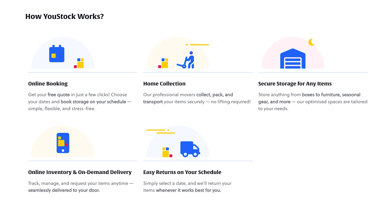
Each step is clearly explained with visuals and short descriptions, making it easy to understand at a glance. It also follows an F-shaped layout, which works well for web readability.
The only missing element here is the sequence.
If we are to improve this, adding step numbers or directional arrows can make the sequence crystal clear, so users instantly know what happens first, next, and last.
When prospects easily understand how you do things, you’re making your offer clear, structured, and repeatable. Your process also shows whether you’re an expert or not, by the workflow you set.
This level of clarity can earn you trust because you’re making your visitors more informed. A key part of the decision-making process that persuades sophisticated business buyers, who tend to be more analytical and deliberate than everyday consumers.
5. Ease the doubts by reducing friction in your lead forms
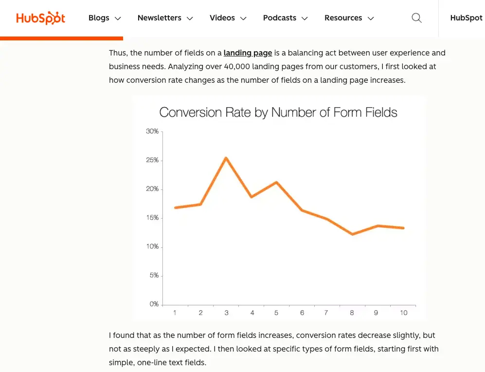
As a general rule of thumb, the more you ask upfront, the fewer people will complete your form.
It's been shown that each additional field reduces conversion rates by 4-8% as it creates more work for the user.
Understandably, as a business, you need enough information to qualify your leads – but you need to strike a balance so that prospects don't abandon your form entirely.
A HubSpot study shows that anywhere between 3 to 5 fields is the sweet spot.
What should you include, then?
Stick to the basics:
- Name
- One key qualifier (company size, industry, or main challenge)
- Message
These are usually enough. If you need more fields, then split them up into a multi-step form. This will help reduce the perceived workload in filling it and still maintain higher conversion rates.
But field length isn’t the only thing that matters.
Where you place the form decides whether people engage with it at all.
Visitors are more likely to engage when the form appears at the moment they’re ready to act — whether that’s right away or after they understand your offer.
For example:
Low-friction offers like newsletter signups or lead magnets don’t need much thought or commitment. Prospects can decide right away. So you can place the form directly in the hero section while keeping it short, simple, and hard to miss.
On the flip side, higher-commitment offers like demos, consultations, or pricing require more commitment. To counter that hesitation, a prospect needs to understand the value of your offer first. Which is why it’s more ideal to move the form below your core value proposition after you've built enough trust and interest to earn the click.
6. Use relevant imagery that validates the value you’re claiming
Visitors form an opinion about your business within 50 milliseconds of landing on your page. That’s why what your visitors first see subconsciously decides whether they'll keep scrolling or click the back button.
This is where choosing relevant images comes in.
Your landing page images, especially in the "above the fold" section (everything visible before scrolling), need to deliver instant clarity and visual focus within those crucial milliseconds.
Images should not be for mere decoration. It should validate the value proposition and credibility you’re claiming. Otherwise, your images will only distract from the business you’re selling.
For example, if you’re a SaaS company, you can use clean, actual screenshots of the interface of your app or platform. Or if you’re offering high-trust services, like consulting, you can feature professional headshots of your team to humanise your service offer.
Whatever you choose, make sure your image shows that you belong in their world. You get them. You understand what they need. And you can help them.
Mews, a property management system for hotels, executes this well in their hero section below:
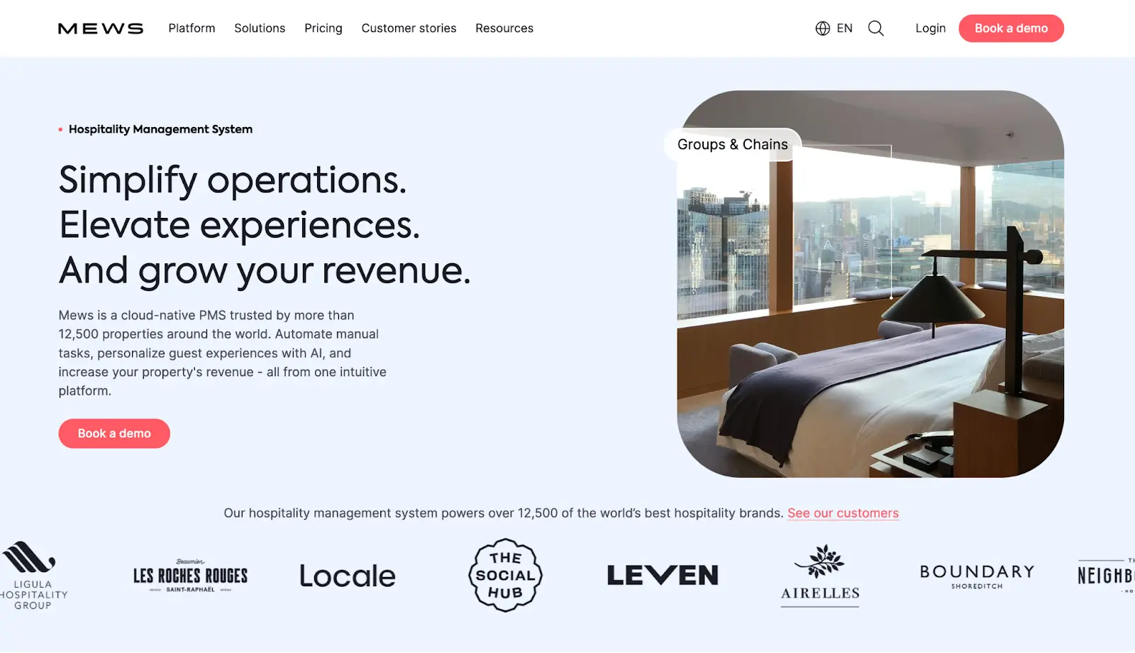
The headline highlights clear benefits: simplified operations, elevated guest experiences, and higher revenue. A high-quality image of a sleek, modern hotel room reinforces that message. This tells you that Mews understands exactly what success looks like for your hotel.
The supporting copy explains how: ‘a cloud-native PMS powered by automation and AI, trusted by over 12,500 properties’. And the logo bar below seals the deal with recognizable hotel brands.
Turn your landing page into a 24/7 growth engine
When you consistently implement these landing page principles, you create a significant advantage over competitors who aren't.
The difference between average and exceptional landing pages often comes down to thoughtful execution of these fundamentals rather than chasing flashy design trends.
Your landing page represents a critical touchpoint in your marketing funnel where small optimisations can dramatically impact your bottom line.
Many businesses understand these concepts but struggle with implementation, especially balancing technical requirements with conversion optimisation. And that’s where we come in.
At SuperPresence, we help businesses transform underperforming sites into growth engines. Our team focuses on high-conversion designs, UI/UX, and SEO to build digital platforms that grow alongside your business.
Get a free website review to uncover specific optimisation opportunities on your landing pages and site architecture. You'll receive a detailed optimization roadmap delivered within 3-5 business days.


![Portrait of a Kecin D Chen [Dark]](https://cdn.prod.website-files.com/6963b46b73d13c416619d604/696770db31b454394fd4709a_5bbdaf7344be9b801e9af82997f5e05f_kevin-photo.png)